What's new
What's new

New Featherweight Prism Design in the Works! 12" Length.

dgfoster

Diamond
Joined
Jun 14, 2008
Location
Bellingham, WA
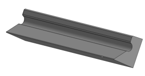
I have had the occasional request for a prism between that is between the 8 and 18" prisms that I designed and cast. So, I am kicking around a 12 that is cored out like the 18 and is similar in shape to both the 8 and 18.

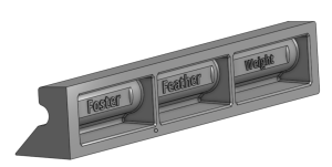
Here is what I have drawn in the last couple days.

1712637277215.png

1712637364498.png


It is about 2" high and the sole is about 1.75 wide. The included angle will be about 45 degrees. Prior to machining it will weigh just under 5 pounds. Machining would remove about .07" x 24X1.5 cu inches of material or not quite a pound. It would be cast as usual in very clean and soft (easy scraping) grey iron.

It will be a bit more complex to cast than the 8 and so a raw casting will be priced in the 150 dollar range.

This is all very early in the process so I am open to suggestions. (Other items to be on the wish list are welcome.) Is this worth pursuing? My new Prusa XL 3-D printer will arrive in 10 days or so. This would be a good first print project for that printer including risers, runners, sprue and cores.

Denis

 
Well, it has been a little over two weeks since I posted about the new 12" Prism/Parallel/ Straight Edge/Level.

The design I was working on focused mainly on the overall size and shape of the casting. I had not really addressed how one might include a level vial in this tool to add precision level functionality. I think addressing level functionality is important as about 5 or 10% of users of my other prisms, 8, 18, and 26" in length, include a level vial in them. I also thought it would be good to make it as easy as possible to do so and not require choosing between using specialized tooling to drill the sole (this is an operation I do if asked) from inside the rear opening or drilling and tapping through the base of the sole. Drilling and tapping from the outside really does no functional harm, but a lot of folks hate to drill through a scraped surface or scrape a drilled surface.

Long story short, I decided to design bosses that could be used to attach a vial holder of the user's design. The bosses would allow for very simple holders to be securely attached with very little effort and no special tooling.

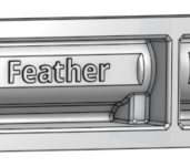
Here is a straight on view of the bosses seen at the lower corners of the center recess.
1714059166259.png

Here is a perspective view of the boss.
1714059222364.png

The boss is recessed enough to allow the vial and holder to be well-within the protected space inside the prism and are easily accessed.

My new large-format Prusa XL 3-D FDM printer came Tuesday and has undergone shake-down testing yesterday with no issues appearing. In fact it is really really a great performer! I am stoked. So, as I type the first pattern for the prism is now printing. I want to see how it looks and feels in the hand. Sometimes what looks OK on paper just does not prove out when examined "in the flesh."

I expect to cast my first prisms in the next few days although the weather here is not promising for a week. The prism should be almost 5 pounds exactly as cast.

Comments on the design pro or con are welcome. Suggestions for improvement are valued.

Denis
 
Well, it has been a little over two weeks since I posted about the new 12" Prism/Parallel/ Straight Edge/Level.

The design I was working on focused mainly on the overall size and shape of the casting. I had not really addressed how one might include a level vial in this tool to add precision level functionality. I think addressing level functionality is important as about 5 or 10% of users of my other prisms, 8, 18, and 26" in length, include a level vial in them. I also thought it would be good to make it as easy as possible to do so and not require choosing between using specialized tooling to drill the sole (this is an operation I do if asked) from inside the rear opening or drilling and tapping through the base of the sole. Drilling and tapping from the outside really does no functional harm, but a lot of folks hate to drill through a scraped surface or scrape a drilled surface.

Long story short, I decided to design bosses that could be used to attach a vial holder of the user's design. The bosses would allow for very simple holders to be securely attached with very little effort and no special tooling.

Here is a straight on view of the bosses seen at the lower corners of the center recess.
View attachment 437328

Here is a perspective view of the boss.
View attachment 437329

The boss is recessed enough to allow the vial and holder to be well-within the protected space inside the prism and are easily accessed.

My new large-format Prusa XL 3-D FDM printer came Tuesday and has undergone shake-down testing yesterday with no issues appearing. In fact it is really really a great performer! I am stoked. So, as I type the first pattern for the prism is now printing. I want to see how it looks and feels in the hand. Sometimes what looks OK on paper just does not prove out when examined "in the flesh."

I expect to cast my first prisms in the next few days although the weather here is not promising for a week. The prism should be almost 5 pounds exactly as cast.

Comments on the design pro or con are welcome. Suggestions for improvement are valued.

Denis
It looks like the font size of "Weight" is smaller than the other text. I'm suspecting it is due to the descending "g" making it more difficult to fit, but I'd suggest resizing the others to match or seeing if 'small caps' are available for your font which should allow consistent font sizes across the tool.
 
It looks like the font size of "Weight" is smaller than the other text. I'm suspecting it is due to the descending "g" making it more difficult to fit, but I'd suggest resizing the others to match or seeing if 'small caps' are available for your font which should allow consistent font sizes across the tool.
Your point is well taken. I will confess to having noted that discrepancy fairly early on in drawing this part and resolving to take care of that "later." And, predictably, I got so taken up in other issues like adding bosses, making a mirror image pattern so I can pour two of these at a time using a core-box-molded sprue, runner, riser, and gate, and making said core box mold that I forgot about the lettering problem. That said, one of the nice things about CAD drawing and printing patterns is that changes are not too difficult to make.

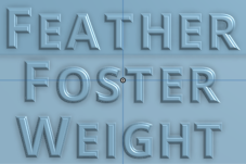
I could use all caps for lettering, but I am sort of revolting against that convention which has previously been forced upon pattern makers since virtually all plastic or metal pattern-making letters are all-caps. And you are spot-on that the descending "G" causes the drawing program to diminish the overall size of the font in that particular word. So, I have fiddled with the font size in the other two words to make them look more comparable in size. Do you think the following reads better?

1714104339525.png

Thank you so much for taking the time to point out this needed change. Are there others?

People with sharp eyes may note the asymmetry of the left and right pattern wall thickness. That is intentional as the pattern will be gated on the thick end and having the end thicker provides extra material to mill off and helps ensure that end of the pattern is the last to freeze when metal is poured. It is part of the strategy I use to prevent shrink defects near the gate.

Denis
 
Last edited:
Okay, it looks like you are using the "Open Sans Soft Bold" font. Small-Caps is a font feature where instead of using lowercase letters (which has the 'g' with the descender that's causing the issue) it uses smaller versions of capital glyphs.

I don't have that font, but here's what I'm talking about using a similar font (Novel Sans Rounded Pro Bold):

font_rend.jpeg

This gives you something more elegant than just block caps, but dispenses with the descender issues and is more bold than standard mixed case.

Sorry to be so pedantic, maybe others won't notice, but I can still see the font size differences even with the changes.
 
Baka,
Once again, thank you for your very helpful response! As an aside, I will say I much prefer the "Oh, that looks great" response 😊 but value much more the "Think it could be better." response. And the most valuable responses are the "Think it could be better in the following way(s)."

So, Onshape has a limited arsenal of fonts available within the program. However, your comments pushed me to do some searching and it appears that Inkscape has a very large variety of fonts AND allows saving files in a .dxf format which can be imported into Onshape. Many font software packages allow saving only in more common file types like jpg etc. only and those do not import in a very useful way into Onshape.

I will post an update later after working out the details. I think it will be possible to use a small caps font but not the one you cited as it is not available in Inkscape. I'll be working on figuring out the details and will see if I can improve the appearance of the lettering. Thanks, again.

I hope other folks will not hold back if they have suggestions as well.

Denis
 
It looks like the font size of "Weight" is smaller than the other text. I'm suspecting it is due to the descending "g" making it more difficult to fit, but I'd suggest resizing the others to match or seeing if 'small caps' are available for your font which should allow consistent font sizes across the tool.

I just assumed that was part of the plan for weight reduction. :D
 
The 'small-caps' is usually a checkbox in the advanced font settings. I use Adobe Illustrator and Fusion 360, so I can't give you firsthand instructions on how to enable it in your software, but if you have trouble PM me and we can work together to get you a DXF outline you can import to your drawing.
 
The 'small-caps' is usually a checkbox in the advanced font settings. I use Adobe Illustrator and Fusion 360, so I can't give you firsthand instructions on how to enable it in your software, but if you have trouble PM me and we can work together to get you a DXF outline you can import to your drawing.
I appreciate the offer. I need to work through the process for Onshape and for getting a file made in Inkscape for export to Onshape. This is needed for this and also future projects. If I get stuck, I will surely contact you. I also have used to a very limited degree Fusion 360 and could, if needed, go there to make a .dxf file for import into Onshape. Right now, I just need to do a little more learning.

BTW, I think Onshape has a somewhat rudimentary text handling capability. But, I do think that using Inkscape to import a .dxf may get around that limitation. Otherwise, I have found Onshape to be a very robust and comprehensive CAD software comparable to any of its competitors. That last opinion is based on limited personal experience but more so on the analysis by CAD software pros doing comparison reports.

Denis
 
You may want to add a bit of material in the ends so you can tap holes for handles or a hanging hook.
I would hope that you add the center of gravity to a drawing so you can add the tapped hole above the center of mass.
 
I guess if one wanted to hang it for convenience, holes tapped into the end faces and parallel to the long axis should do. There is plenty of meat there for that purpose. In fact, I will almost certainly drill holes in the ends for fixturing these prisms for milling. I fixture the 18 and 26 in that fashion. But I make no attempt to match the axis of the fixturing holes with the CG.

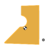
Here are the CG locations as cast, though the location will shift away from the left side as it is machined to equal the right.

1714160878036.png

1714160985713.png

I suppose it will not be confusing to anyone, but if you look at the end view, you can see the plane of the sole and the top rail are not parallel. This is intentional as it is necessary for the molding process used in casting the part. Subsequent machining will make those face planes parallel.

Denis
 
Last edited:
I did some work over the last day or so and found a way to use any font I want in Onshape to convert it to all caps and fillet it so that it should release well from the sand. I will be CAD "cutting and pasting" the ones shown below (or perhaps some modification thereof) into the pattern for the 12. Of course, the artistic rendition shown here translates pretty well into FDM printing. I will be doing some fairing using an excellent catalyzed high build primer that will in a single coat provide a nice thick and smooth surface that cures in 3 hours and sands very well without loading paper.

Thoughts?


1714238194210.png


Denis
 

Attachments

  • 1714236345327.png
    1714236345327.png
    227.9 KB · Views: 4
  • 1714235317301.png
    1714235317301.png
    93 KB · Views: 4
  • 1714235153548.png
    1714235153548.png
    83.8 KB · Views: 4
Since I'm making you deep dive into fontagrophy...

The spacing between letters is called kerning and is usually automatically set. However it isn't always perfect when certain letters are next to each other and for important things like a logo or labels is usually hand tuned by the typesetter. Let me call your attention to the "F" and "o" in Foster. Because the bottom of the F is open and the o is round, excess space exists between the two glyphs and leads to somewhat awkward spacing between the two without tightening the kerning at that transition. A similar issue with the "a" and "t" in Feather. Some of the characters with very tight fits like around the "i" characters could actually have a little more kerning space to loosen them up and keep the density similar across the three words.

Ideally you can use the outlines of the individual characters to adjust the kerning in these critical areas. A little goes a long way, I'm talking about very small adjustments, hopefully you can see what I'm talking about and are comfortable making the changes.

I did adjust the tracking between the small cap letters and the kerning between the large caps and the second letters in the letter plates shown in post 12 above. I did the kerning manually as what you see is a actually mashup of two strings of letters in each word juxtaposed to form the word. Onshape does not allow individual kerning adjustments except between first and second letters in a string. I think I am going to say good enough on this casting.

My much greater concern is that the sand actually pull cleanly from the letters. If you look closely you will see that some of the letters with central "pits" like "A's" have been infilled a bit and the G is especially problematic. It has been infilled in the area constricted by the curve of the lower half of the letter. Given that normally lettering is done with individual metal letters each on a base plate of uniform width (no Kerning and no Tracking there), I am going to call this close enough. I very much appreciate your input and I do think the Large/Small cap appearance is much better than the prior setup.

I just plugged in the flash drive into the printer. The print should finish just over 12 hours from now.

I want to pound some sand by Tuesday of I can get everything set. There is more work to do as some special armatures will have to be embedded into the sand to get the deepest areas to pull without breaking off. Even with the armatures it may be dicey. I want to see if I can do this casting without making a silicate core for the lettered side of the mold. It'll be touchy. But I think it can be done.

Denis

Added: I do not want to get fontaphobia which can be a complication of fontagrophy which is a subset of typography. Fontaphobia can lead to paralysis known as infinite kerning and loss of tracking. This results typically in failure to make an impression and utter lack of expression.
 
Last edited:
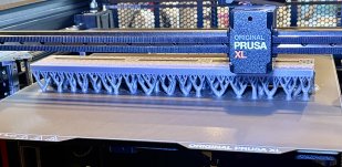
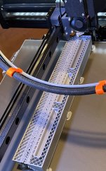
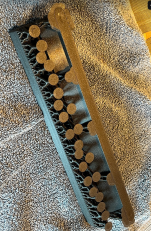
I would not be surprised if some of the members of the forum have not seen a lot of 3-D printing in progress. So I decided to put up a couple pictures of the pattern as it is now about 2/3 printed.

Here is a view of the pattern from the front of the printer, showing the rectilinear lines of the pattern itself, and then the tree-like forms that are “organic” supports that that will peel off later. Besides being fascinating to look at, the tree-like organic forms are actually more efficient at supporting the print as evolves than were the old rectilinear supports previously available.
IMG_0831.jpeg

Here is a view from above showing the linear infill pattern and you can see that around the perimeter are four layers of material rather than the common two layers. I beef up the perimeters a bit to a provide a good surface in case any sanding is needed and to make the pattern a bit more robust. These plastic patterns are very tolerant of dropping and general abuse that they find in the the Foundry. If I draw them correctly, they have ideal draft everywhere, and tend to draw from the sand very nicely.
IMG_0832.jpeg


Denis
 
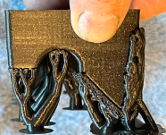
I have been painting and finishing one of the two patterns and reprinting the 2nd pattern to get better resolution of details and to make a couple tweaks. And just so folks can see what the supports look like in a print after it comes off the build plate I made a few photos.

Here is an end view of the pattern with supports in place. I print the pattern "upside down" as I want the open side up to make the lettering and inside surfaces have the best resolution. Doing it that way takes a lot more fiddling but is worth it in terms of print quality. The supports are needed as the filament is extruded from the printer as a near-liquid stringy material and has to be supported for the short time it takes to solidify. The printer incorporates fans to hasten cooling. But you still can't hang molten "wires" in space. Those supports are engineered to just barely make contact with the print and peel off fairly easily and cleanly when the print is finished.

1714570974181.png

Here are a couple more views
From the build-plate side of the print. The long ellipse of material on the right (as seen) edge is temporary and added to improve print stability as the piece would tend to warp without it. You can just make out teardrop-shaped puckers at each end where the pattern tried to lift.
1714571037558.png

And this is what the open side looks like.
1714571248641.png

A few heavy-ish coats of lacquer will cover the layer lines well enough. A pic or two of that later...

Denis
 
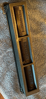
The pattern above has a few coats of lacquer and a little Bondo on it. I will try to make a mold with it this afternoon. I did make a wire armature to help support the sand in those deep recesses. I do not have high expectations.


IMG_0851.jpeg


IMG_0852.jpeg

This image shows how I use heavy coats of lacquer to fillet the letters to help them draw cleanly.

IMG_0853.jpeg
Fingers crossed.

Denis
 
Maybe I missed, but what filament are you using to print patterns like this? I know some plastics don't play well with lacquer paints and fillers.

I appreciate your detailed posts on the process. I have a few projects needing one-off castings reproduced and that expensive pattern shaped gap between a paper print and the foundry gets a lot more manageable with tools like CAD and 3D printing. I have at least one that has so much draft and geometry causing errors in the model, that I think printing what I can and using paint and filler to manually smooth out the rest will make it a lot simpler.


Back
Top